Wednesday 6 February 2013

possible final designs.

The outer design of my pyramid. Possibly put a barcode on the bottom? 

The design of my sleeve. (With logo and illustration)

What the pyramid will look flattened. Including 4 pieces of information.

illustration

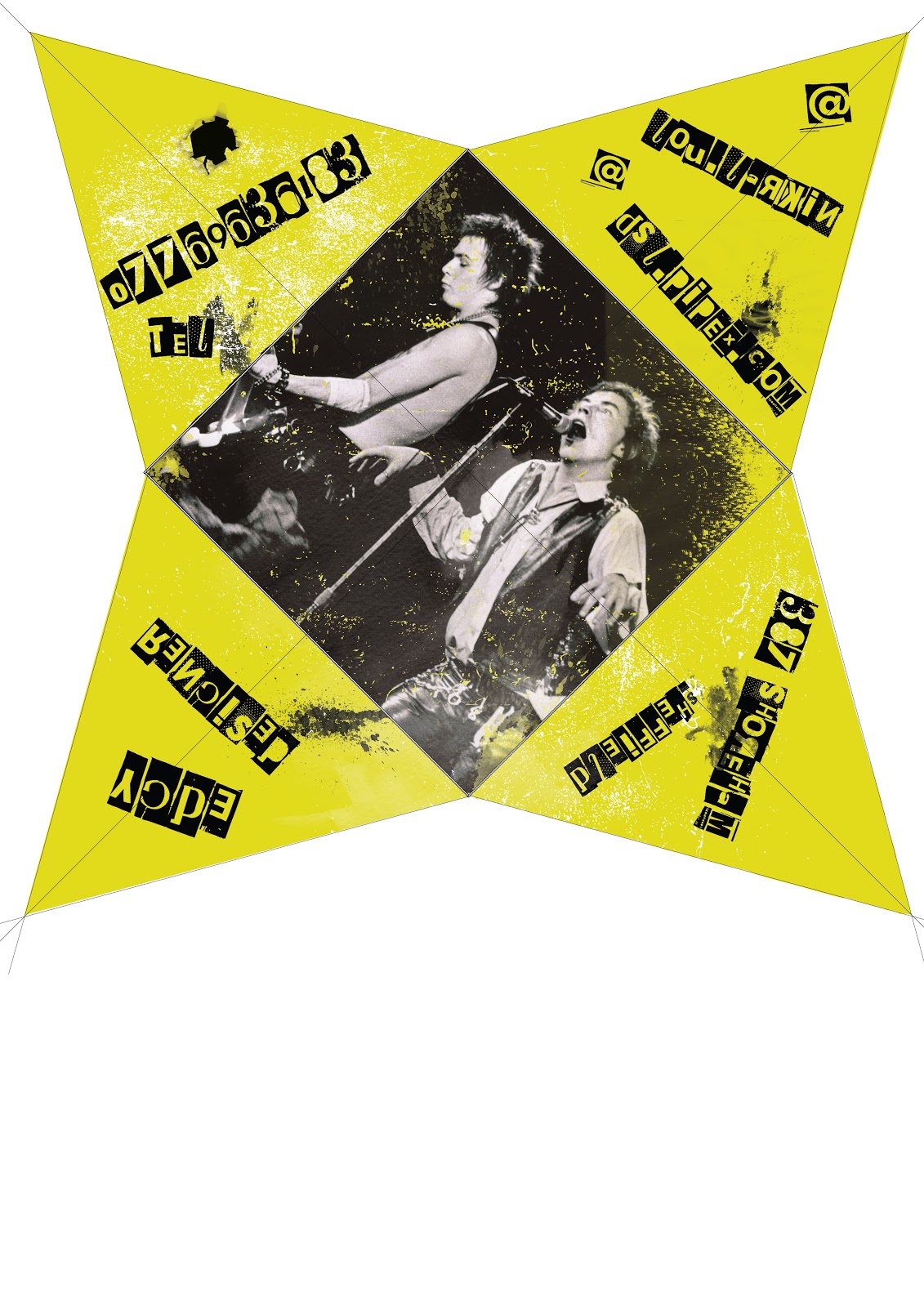
After looking at various other punk posters such as daft punk tour posters etc. I have decided that the design on the sleeve of the pyramid will be illustrations of iconic punk members along with my logo. I have decided to go with the icons: Sid Vicious, Johnny Lydon (Rotten) and Joe Strummer. Not only were the sex pistols and the clash important within the punk movement, they are also in my favourite bands.

I've drawn these on photoshop using the paintbrush tool. 


Part of Johnny Rotten's face, merging into Sid Vicious' to show they are part of the same group.


Type

I have never been interested in type as much as I have with illustration and design layouts, therefore I haven't focused as much on this as I have the rest of the project. I have been looking on various websites such as dafont.com, where I found a very strong punk based text called 'Phorssa ' which looks similar to the text used on the Sex Pistols posters and 'Never mind the bollocks' album cover.
Here are a few examples of some types I've tried using (The first is my chosen font):


logo further

This is my 'bullet' logo progressed further. Using my customise paintbrushes on photoshop I have tried distressing the logo to fit in with the rest of my design (hopeful final design.) However I felt even this logo wasn't distorted enough with the straight edges of the type. So I tried distressing this further. 


This is the logo I have decided to involve in my final piece. It is distorted enough to fit amongst the rest of my design successfully I believe. I also believe the brushstrokes represent movement from the bullet... as though it's smashing through the design/painting and the scratches on the surface are the identity marks which are made on bullets from a gun once fired.


Logo

This was the base of my final logo design. I decided on this because it was more anarchy than the 'box' logo. However, when I looked at this logo and tried it out within my design it didn't fit in with it at all. This is because it's too clean cut compared to my design. Even though my design is based in photoshop I have given it a rough appearance with customised brushes giving it the effect of rough cut which punk design was renowned for. So even though I may be able to use this logo in other pieces of work for this particular piece it just didn't fit. So I have progressed and distressed the logo further. 

Monday 4 February 2013

final 3D net

As I was looking through research of packaging, the pyramid shape was still my favourite packaging idea, especially because it represented a stud. (Very common in punk fashion.) However, I still wasn't keen on the opening the idea had on it, so I decided to come up with an alternative. 
This is when I came up with my final idea. I decided that instead of making the pyramid a sold box, I would create a sleeve which would hold it all together. Once removed it would open up (as seen above) with the four pieces of information on each triangle of the pyramid. This would give me the opportunity to do several designs to show my skills rather than just the outside of one box, and I also believe that it is complex enough to represent the 3D aspect of the module. Below is further examples of how I intend my final piece to look like (not precise design.)


Sunday 3 February 2013

3d prototypes

Even though I was reluctant from my first attempt when making the prototype I experimented with the same shape but using a different method. With this one I thought it might represent a mohawk better with a fanned piece of card in the middle of it, rather than it being a solid box.

Again, this was a rough draft to see how it would look without wasting too much time if it wasn't successful. This method didn't sway me to using this shape anymore for my final piece however, so I began looking for other shapes and methods again via the internet.

first prototype


After looking at various packaging ideas, this was my first basic prototype. It was very rough as I didn't focus on measurements because I was trying to figure out how the net should be drawn first. however after seeing this basic idea in 3D form I was reluctant to take it further.

Saturday 2 February 2013

3D images

Here are some images of 3D packaging that have caught my eye.


3D Ideas

This is one of my favourite packaging designs. I've been researching creative packaging design and been trying to sway away from a simple box. I've been trying to find a shape which could connect to the punk genre but still be a structure which is reliable enough to contain something to sell. This is when I came across this packaging on the site. http://www.youthedesigner.com/2011/09/05/packaging-design-40-creative-box-designs-thatll-bowl-you-over/ It resembles, I believe, a stud which was a very common fashion piece on punk clothing. Along with it linking very well into the genre, it also has a strong reliable structure I believe. However I would change the opening to something less complex, possibly having it as a sleeve rather than an opening at the top so that when it's opened the design isn't broken up.

3D

Even though this packaging isn't anything how I want my final outcome to look like, it's priority is the design which is what I have been prioritising within my sketchbook. I have come to the decision that the design is more important to me than the actual packaging. I want to be able to sell a simple shaped box (possibly) through the design rather than the box itself. And I feel that this packaging proves that a simple box but with an effective design can do just that. 
I would much rather have a very clean simple box than having fancy folds and openings over powering the effect of design. This is because I feel if I try to make both sell the packaging there could be a clash within making it, hence prioritising the design above the packaging. 


possible designs


I have been looking through old punk designs, and after looking at a vast range I have felt that I would create something similar to the poster above. I like how simple it is with the cut out type and inverted image. I still feel like my design should have some splash of colour, but researching I have started wondering if I could make black the main block of colour rather than the bold colour I originally thought about using. (Ie. Yellow from previous posts)