Wednesday, 8 May 2013
More experimenting
This is one of the clippings of music I tried but it didn't fit well enough with the music I felt and finished too abruptly.
videos gone wrong
Both of these videos are different frames per second. I do like the way that Beth says so far so good in the first video, however I prefer the slower pace of the the second video and decided to go with that choice.
Sunday, 5 May 2013
screenshots
These are a few screen shots of me experimenting with After Effects. It's a difficult software I've found to use and have not enjoyed using it.


Arranging video
This is an image of roughly the order in which my animation will go in, and a rough guide of the fps and how long each scenario can be.

Silent movie type ideas
Because I have decided to give my animation a theme of a silent movie I have been looking up fonts and clips of when the type appears during the film. Here are the images I have made for my animation based on the viewings.


quick story board
Because I was told my story board was too complex this is a quick alternative story board to show what will happen (very rough display).
Saturday, 4 May 2013
more messing with icananimate
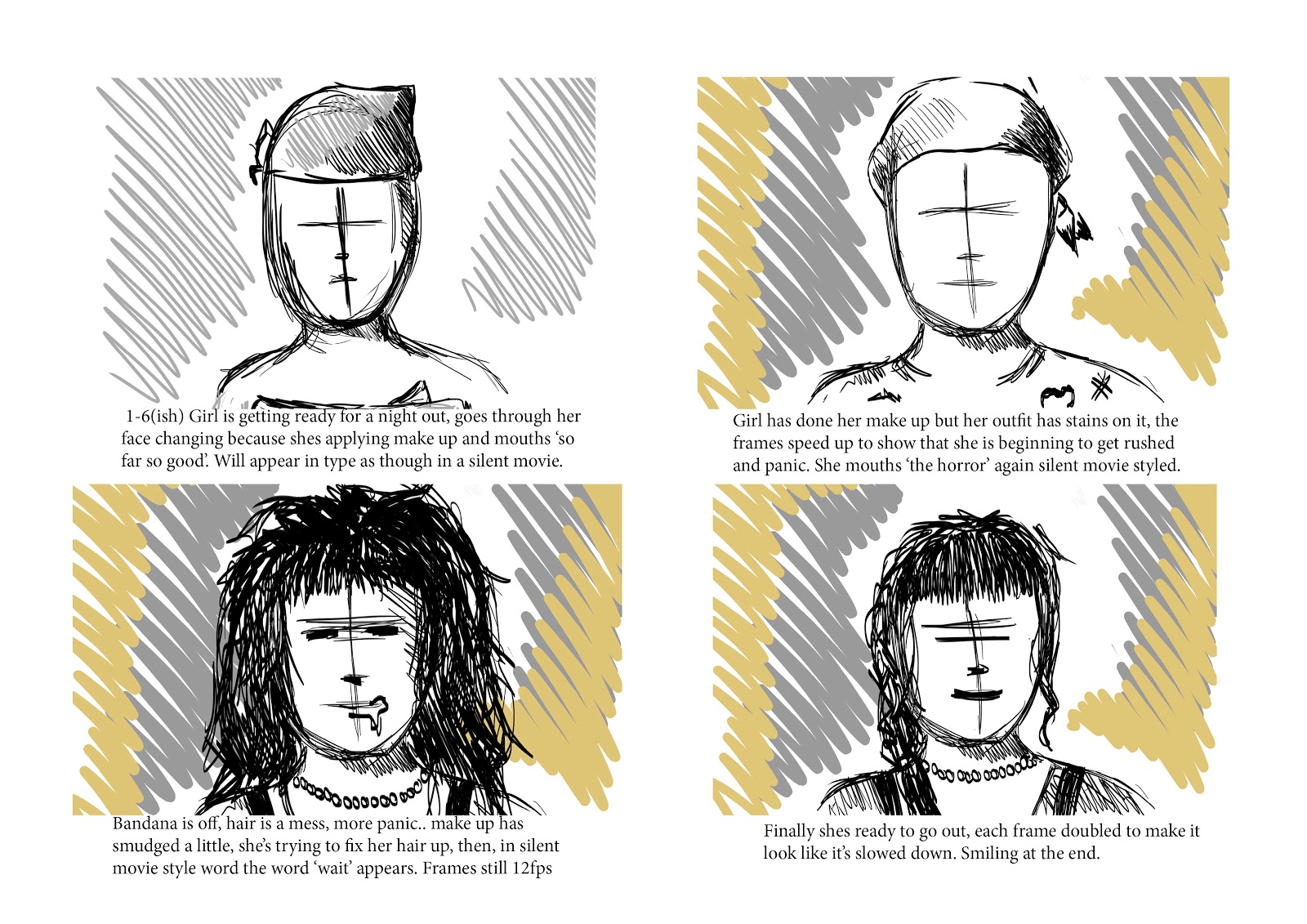
This is just a rough idea of what I wanted to do with my housemate Kim. I was told my story board was too complex for a 30 second animation so I simplified it to a girl getting ready as though she's applying her makeup in a mirror and stressing as things start going wrong. This is just a test to see how it would work if I used I can animate. I quite like the jumpiness of the video and would work well with it being a silent movie piece.
Tuesday, 30 April 2013
Monday, 15 April 2013

Sunday, 14 April 2013
Previous Idea
These images were from my previous idea story board when i was considering illustrating characters for my animation. However I am not allowed to use them so they have been put down as my experimentation.


Quick
This is a very quick photomontage I put together using Photoshop CS5.
I don't like it at all, I prefer being able to see the individual photos printed and laid on a table so you can alter the angling etc.

Story line basic
Roughly one of the possible story lines.
1- 7 secs
Photomontage of girl getting ready for her date (50s style to fit with music)
Close up of eyes from natural to make up
7-12 secs
Photomontage of guy eating, not getting ready.
Notices the time and starts to panic.
12-15 secs
Close up of girls lips
Girl smiles
Zoom out to a picture of her face.
16-21
Guy trying on clothes, stained etc so Starting to panic.
Close up of his face, emphasise frustration
22-25
Girl putting on shoes
Stands up ready, smiling.
26-30
Guy (A mess) pulling hair
comical tic like in old movies using photomontage.
Finish with a close up of clock.
(music will end on the sliding note of the strings)
photoshop.


These a re a few snap shots of me experimenting with animation via photoshop. I managed to make a ball bounce up and down from one side of the screen to the other. I enjoyed the process but I think I would rather stick to doing something with photography and a video camera.
I will upload the animation once I have figured out the right format needed for this blog
photomontage

I think if I could achieve an animation in the style of this photo montage I would be really happy, I would keep the hectic, getting stressed theme and alternate between various images of the persons lips and eye expressions. Possibly having one part with the eye opening and closing quickly to resemble a tic which is used humorously within old films to show irritation.
I may not use as many different photos of the person though, restricting it to the face, eyes, and mouth. rather than splitting the person up as much as above.
alternative ideas
This video I have found very interesting to watch, I like the way the photos move left or right etc when the person within the photograph is moving that way. Seeing as I am not allowed to use illustrative characters in the animation I feel using photography along these lines is something else i would be interested in doing. I may consider mixing both photography and illustration to see the outcome as a still image and if it could progress into a short animation.
Wednesday, 10 April 2013
Various videos of interest
I have posted this video because I like the bit in the video where he uses the cassette tape to make a small animation/image of the girl altering it (supposedly) with his hands. Although this is too complex It makes me wonder if I could used my hands within the animation when placing photos on top of one another and seeing what it would turn out like.
With this video I like the split screen approach it has to the two central characters. Especially within the first minute or so. I may try that but with my photomontage, however it would create some complications with my story line and would need altering.
alternative
I have been struggling to come up with an animation that isn't based around literal characters. With my piece of music I envision an old type flick book animation of a family trying to go on a day trip, it's typically rushed with the dad getting more and more stressed as the trip goes on. However, we've been asked too look into more motion graphics and abstract animations.
I quite like how simple this animation is by using a time lapse video, I think in the next few days I will look more into photography and how that can be used for animation rather than drawings and photoshop.
Tuesday, 9 April 2013
flick book continued
These are just several more flick books which caught my interest.
This video is very different to any other flick books I have seen, instead of making the entire animation through the flick book it has incorporated the flick book within a short film. I find it extremely compelling and interesting to watch. Although this doesn't fit my old rushed illustration I am intending on doing, it's given me a real insight that animations can be more than just a flick book.
flick books
This is one of my favourite flick books I have seen so far, it's so well done and precise yet he manages to create slow motion scenes within the illustrations. I also like the way its filmed where you can clearly see it is on paper. it also connects with my theme of keeping it black and white to give the impression the animation may be older.
I will look through flick books more and make a decision whether to follow on with this method or animation via photoshop.
This flick book caught my eye because it's so simple yet appears complex with the rotation the artist has managed to create. Although this isn't something I can put to my music because it isn't hectic enough, it has showed me how a simple animation can look so effective.
Tutorials on photoshop animation.
These simple videos are helping me see how difficult it may be to create an illustrated animation. I am firstly going to try do a scene with an old car bopping up and down and see how well it comes out after my first attempt.
Winsor McCay
This is a video from one of the first animators Winsor McCay. I specifically like this video because it's what I envisioned my own animation to turn out like. It's quite clear it's an old animation by the way it's not quite precise and jumps slightly in various scenes. Also I quite like the effect the camera has where it's a little sketchy and making distorted marks on the paper.
Sunday, 7 April 2013
I have decided to look more in depth on how to make an animation using photoshop and this was one of the videos i looked to give me a demonstration. Although it only shows the very basics it has helped me understand the fundamentals and made me interested in seeing how complex an animation photoshop can create.
I will also look at a flick book approach to be sure that my illustrations wouldn't look better hand drawn rather than through a graphics tablet.
Music
My music is a fast paced string compilation called stratosphere boogie. When listening the following words came into my head:
Summer
Hurried
Old
So i have decided to do an illustration based on a family going on a road trip to the beach, having various problems on the way so the 'dad' gets more and more stressed. I will also use old techniques ie. A map with a drawn car moving along the streets to show the route of which the family are going.
I will start looking up illustrators to see what would be a suitable type of character for this animation.
Thursday, 28 March 2013
research continued
http://www.youtube.com/watch?v=gyBc4yR9JlQ&feature=endscreen
This has been one of my favourite videos to watch, it seems to have characters but the video mainly consists of just shapes and their movements making them look characteristic. I like how clean cut it is with out any rough lines as would been seen if everything was drawn. I will have to search more in depth on videos like this to see if this is an idea I would like to take further.
This animation is similar to the video above but not as professionally done I feel. It still follows the guideline of using shapes to make their frames. I like the idea of just using black and white in my final animation with maybe a splash of one other colour at certain moments to emphasise something.
Research animation
http://www.youtube.com/watch?v=Ga48XKYjFLM
This video has several different abstract scenes which would be interesting to use within my animation. I particularly like the part at 3.40 mins with the gears. It's still abstract but seems to have a character to it. I may consider this when designing my story board.
http://www.youtube.com/watch?v=tTvXssN6t0A
This is another abstract animation but compared to the video above I don't like it as much, it fits the music well but it wasn't generally enjoyable to watch overall.
Wednesday, 20 March 2013
Wednesday, 6 February 2013
possible final designs.

The outer design of my pyramid. Possibly put a barcode on the bottom?

The design of my sleeve. (With logo and illustration)
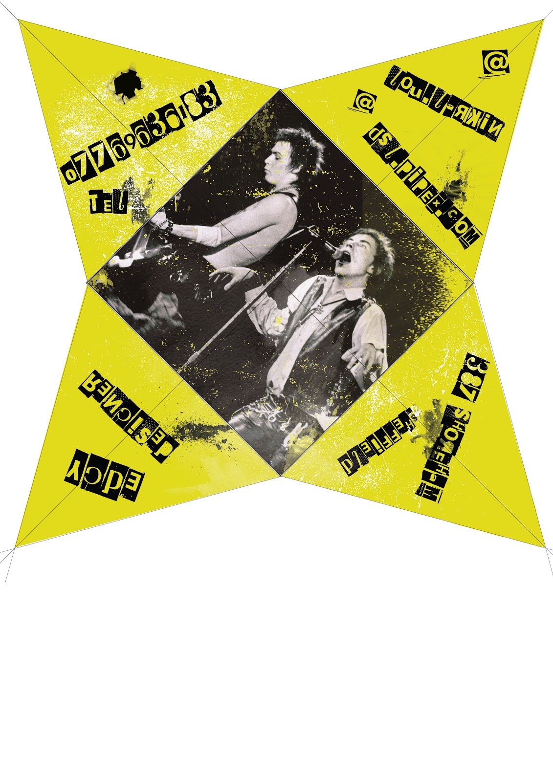
What the pyramid will look flattened. Including 4 pieces of information.
illustration
After looking at various other punk posters such as daft punk tour posters etc. I have decided that the design on the sleeve of the pyramid will be illustrations of iconic punk members along with my logo. I have decided to go with the icons: Sid Vicious, Johnny Lydon (Rotten) and Joe Strummer. Not only were the sex pistols and the clash important within the punk movement, they are also in my favourite bands.


I've drawn these on photoshop using the paintbrush tool.

Part of Johnny Rotten's face, merging into Sid Vicious' to show they are part of the same group.

Type
I have never been interested in type as much as I have with illustration and design layouts, therefore I haven't focused as much on this as I have the rest of the project. I have been looking on various websites such as dafont.com, where I found a very strong punk based text called 'Phorssa ' which looks similar to the text used on the Sex Pistols posters and 'Never mind the bollocks' album cover.
Here are a few examples of some types I've tried using (The first is my chosen font):


Here are a few examples of some types I've tried using (The first is my chosen font):


logo further
This is my 'bullet' logo progressed further. Using my customise paintbrushes on photoshop I have tried distressing the logo to fit in with the rest of my design (hopeful final design.) However I felt even this logo wasn't distorted enough with the straight edges of the type. So I tried distressing this further.


Logo

This was the base of my final logo design. I decided on this because it was more anarchy than the 'box' logo. However, when I looked at this logo and tried it out within my design it didn't fit in with it at all. This is because it's too clean cut compared to my design. Even though my design is based in photoshop I have given it a rough appearance with customised brushes giving it the effect of rough cut which punk design was renowned for. So even though I may be able to use this logo in other pieces of work for this particular piece it just didn't fit. So I have progressed and distressed the logo further.
Monday, 4 February 2013
final 3D net
As I was looking through research of packaging, the pyramid shape was still my favourite packaging idea, especially because it represented a stud. (Very common in punk fashion.) However, I still wasn't keen on the opening the idea had on it, so I decided to come up with an alternative. 

This is when I came up with my final idea. I decided that instead of making the pyramid a sold box, I would create a sleeve which would hold it all together. Once removed it would open up (as seen above) with the four pieces of information on each triangle of the pyramid. This would give me the opportunity to do several designs to show my skills rather than just the outside of one box, and I also believe that it is complex enough to represent the 3D aspect of the module. Below is further examples of how I intend my final piece to look like (not precise design.)


Sunday, 3 February 2013
3d prototypes
Even though I was reluctant from my first attempt when making the prototype I experimented with the same shape but using a different method. With this one I thought it might represent a mohawk better with a fanned piece of card in the middle of it, rather than it being a solid box.

Again, this was a rough draft to see how it would look without wasting too much time if it wasn't successful. This method didn't sway me to using this shape anymore for my final piece however, so I began looking for other shapes and methods again via the internet.

Again, this was a rough draft to see how it would look without wasting too much time if it wasn't successful. This method didn't sway me to using this shape anymore for my final piece however, so I began looking for other shapes and methods again via the internet.
first prototype


Saturday, 2 February 2013


3D Ideas

3D

Even though this packaging isn't anything how I want my final outcome to look like, it's priority is the design which is what I have been prioritising within my sketchbook. I have come to the decision that the design is more important to me than the actual packaging. I want to be able to sell a simple shaped box (possibly) through the design rather than the box itself. And I feel that this packaging proves that a simple box but with an effective design can do just that.
I would much rather have a very clean simple box than having fancy folds and openings over powering the effect of design. This is because I feel if I try to make both sell the packaging there could be a clash within making it, hence prioritising the design above the packaging.
possible designs

I have been looking through old punk designs, and after looking at a vast range I have felt that I would create something similar to the poster above. I like how simple it is with the cut out type and inverted image. I still feel like my design should have some splash of colour, but researching I have started wondering if I could make black the main block of colour rather than the bold colour I originally thought about using. (Ie. Yellow from previous posts)
Subscribe to:
Comments (Atom)